Changelog
Follow up on the latest improvements and updates.
RSS
For easier usability of components, once a style is set, the editor now remembers the previous style settings of a component in the story and applies the same to a new component added.
We've made improvements to our textbox- with "auto-size" the textbox size dynamically adjusts to the size of the content as you type.
We’ve added border, shadow, and rotation controls on all elements, including textboxes and images. All of these options can be found in the contextual panels on the right.
Open another Maker story in the modal by selecting the new link option "Open Story in Modal."
To learn more, click here.
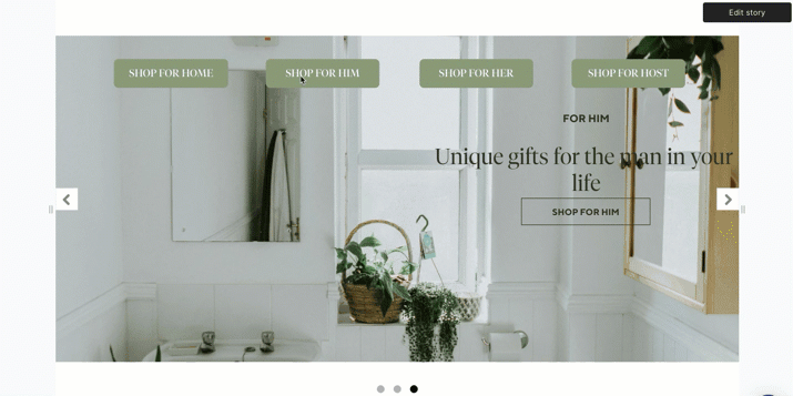
Trigger slider navigation using the "Link to slide" option to elements or components from inside or outside any slider.
To learn more, click here
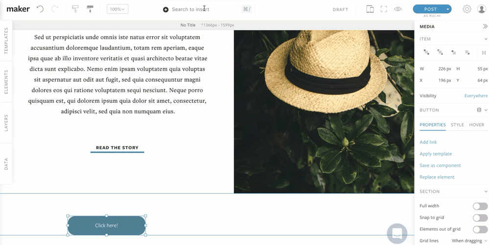
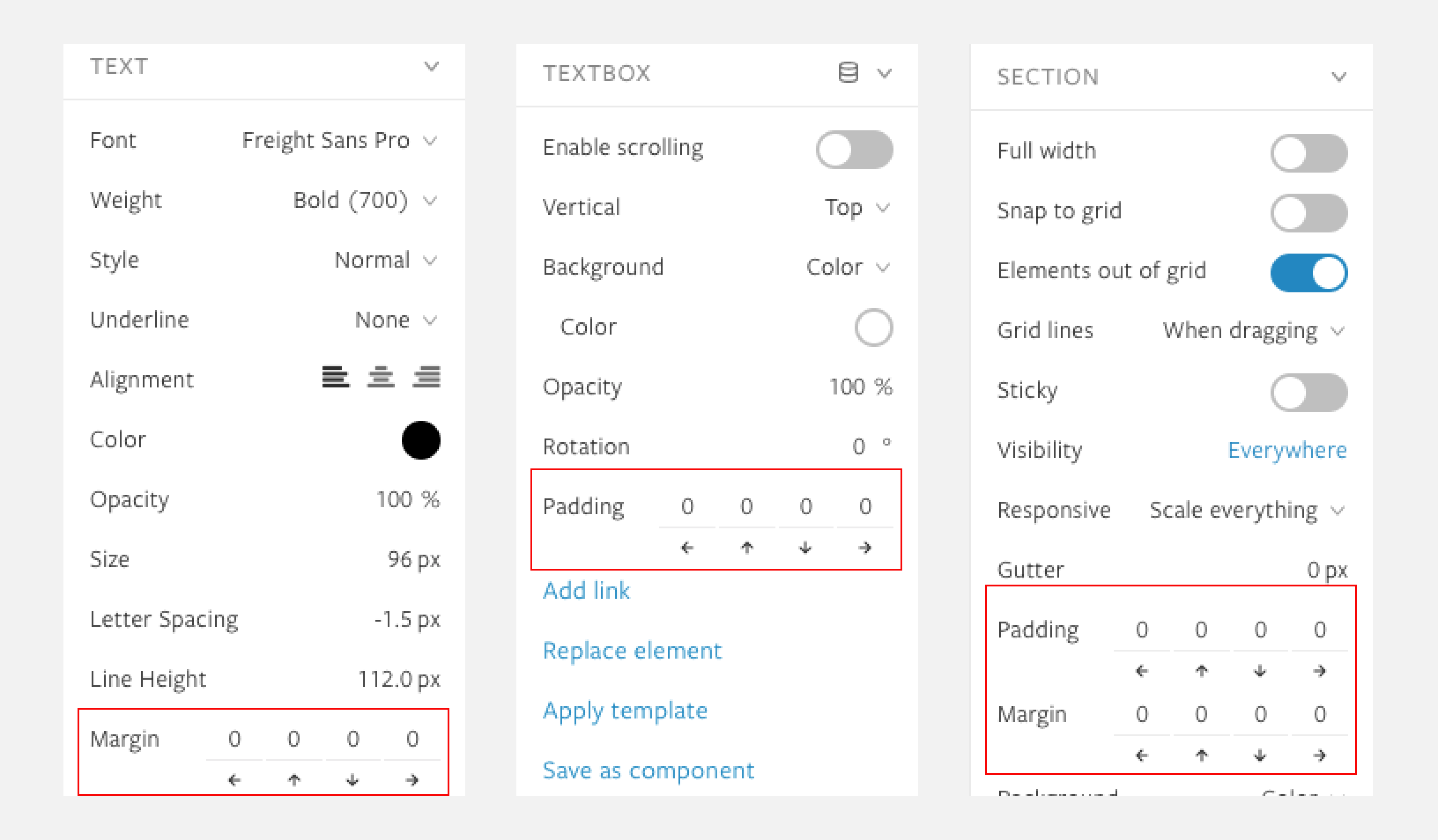
Get granular control on the spacing of sections, text and textbox with new contextual panel options for padding and margins.
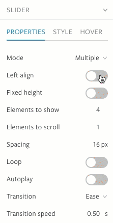
We've added two new slider options in the contextual panel for Element sliders- Left align and variable slider width. Both options can be found under the properties tab for the slider.
To learn more, click here.
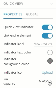
Set the pin visibility to show always, never, on hover, or softly disappear from view after a few seconds with the auto-hide option.
To learn more, click here.
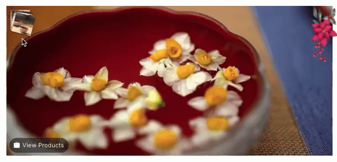
Show the products tagged in the video with options to customize the visibility of the product.
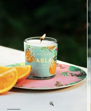
Show additional product images in a smooth scroll slider
Load More
→